
Communications professionals swoon over the idea of integration – aligning all the individual components of an organization’s brand. Big businesses integrate relentlessly: the font that your mobile phone company uses in their logo also shows up on their website, on employee t-shirts, even in the fine print of their service contracts.
Small businesses often miss integration entirely. One local retail shop in Victoria had something like 17 fonts in their store signage. It was hard to tell what signs belonged to the store and which ones were randomly plucked from a child’s backpack and affixed to the wall.
But local organizations don’t always miss out. A fascinating example of comprehensive integration at a single location is the font used at Club Malibu, a remote camp on the Sunshine Coast of British Columbia (pictured above). I had the pleasure of visiting recently and would count it among the top three most beautiful places I’ve ever seen. It’s an hour-and-a-half boat ride from civilization, situated at a junction of two fjord-like inlets and surrounded by glacier-tipped mountains. Waterfalls cascade down the sides of the cliff walls descending thousands of feet into the ocean below.
In this other-worldly place, the camp has developed a custom font for its signage. The letters are angular with overlapping straight line segments that can be easily carved into wood.


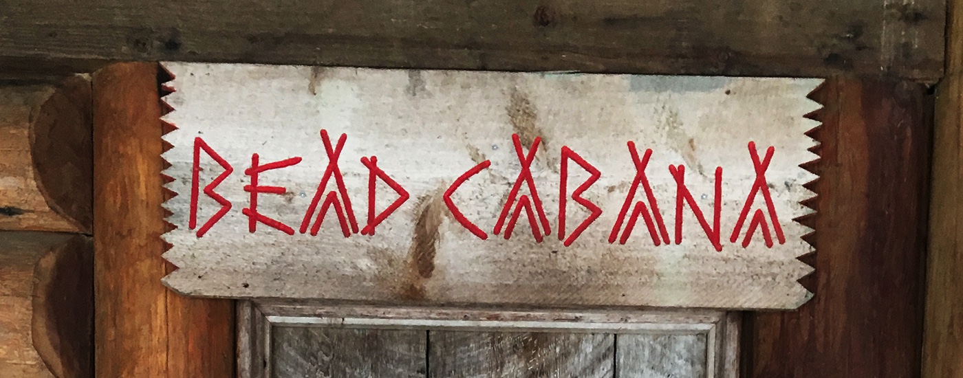
The alphabet includes a few stylized letters such as an uppercase “A” in the shape of a tent. All of this may seem tacky out of context, but it works in the environment.
Interestingly, the Malibu font is also dutifully traced by staff on a white board every day to announce the schedule of events. I imagine some staff hate writing announcements with the Malibu font – indeed, the lettering in this picture seemed a bit hasty.
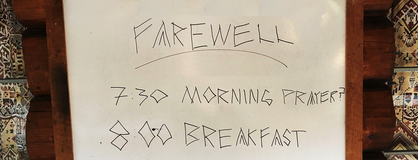
Nevertheless, the degree of integration – all the way to the bulletin board – is astounding. And it does lend a certain cohesion to the camp experience. Without seeing a Malibu Camp logo or anything else, you know from the shape of the letters alone that breakfast will be a Malibu breakfast. (It was yummy!) This attention to detail heightens the sense that campers are decidedly away from the rest of life.
In the end, I still find that some organizations obsess far too much over integration. The pursuit of complete brand integration can become a make-work exercise that only results in corporations seeming even more impersonal. But when done well, it can add a noticeable degree of cohesion and confidence to an organization’s brand.
top photo: Ken McMillan (CC BY 3.0)