In the design world, iteration is necessary and repetition helps. But there is something about operating by sheer instinct, taking a complete creative leap, and letting our brain thin-slice through a complex problem. There is no substitute for that very first creative impulse, even if it is riddled with mistakes.
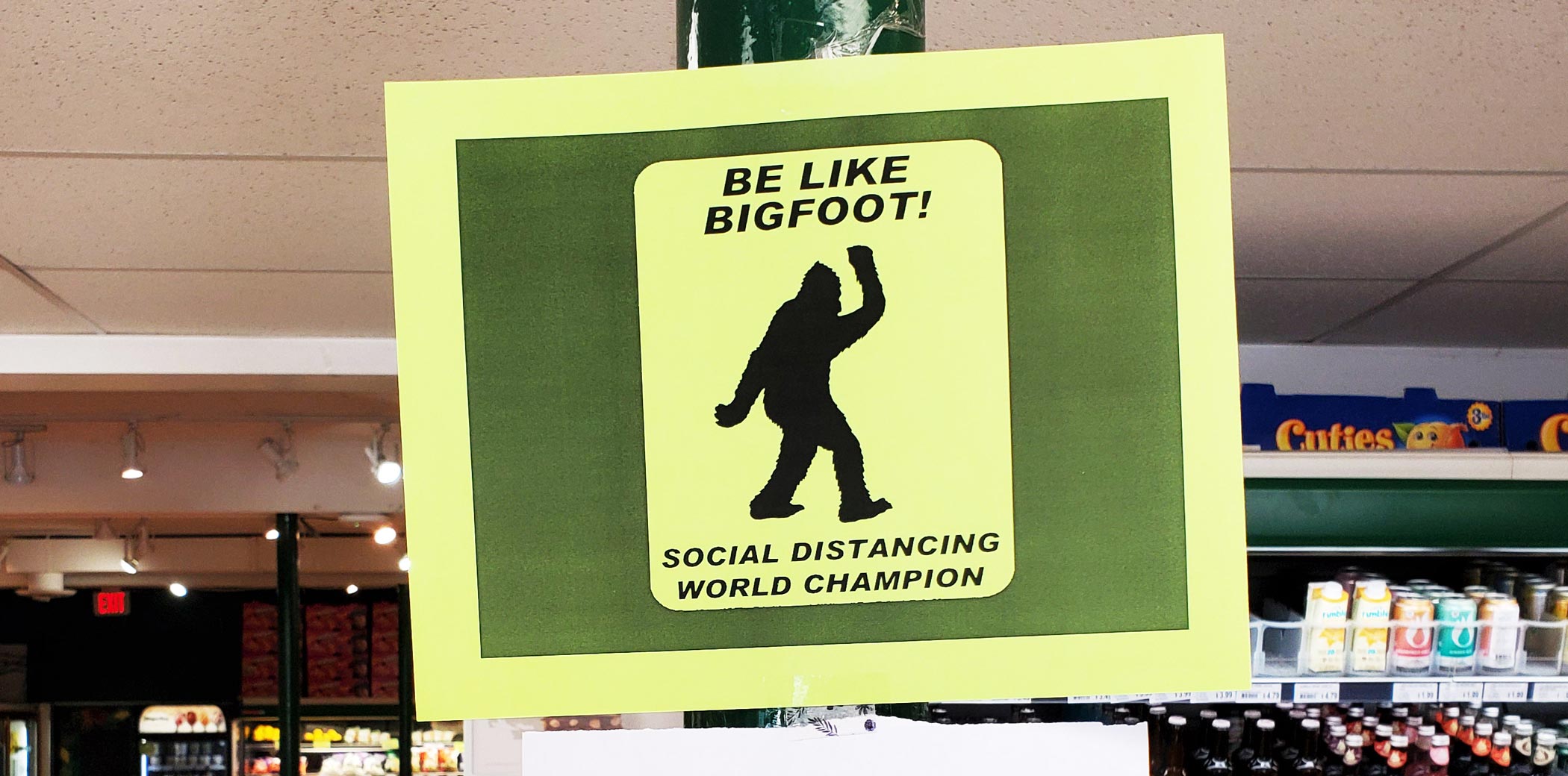
For example, below is the very first social distancing sign I saw at the start of the COVID-19 pandemic. It was posted at our local grocery store days after the pandemic began. The illustration is pixellated and the fonts are boring, but the concept is brilliant – especially for the Pacific Northwest. Weeks later, even after city governments and countless design agencies developed their own messaging, this remains a favourite. It’s imperfect (and problematic for those unfamiliar with Sasquatch) but way more fun and memorable than stick figures set two metres apart.

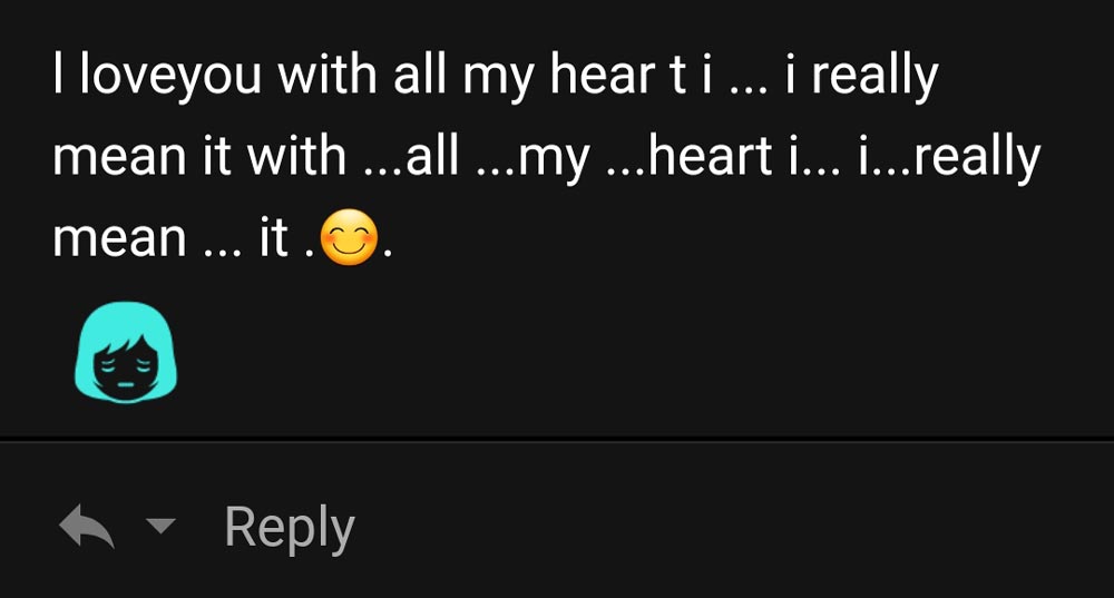
As another example, below is the very first email my seven-year-old daughter ever sent. From a grammatical perspective, the punctuation is a mess and there are several prominent typos. Literary critics might shiver at the needless repetition. But for a child just learning to type and desperate to send me a message, it’s priceless. This will probably be one of the best emails I ever receive:

