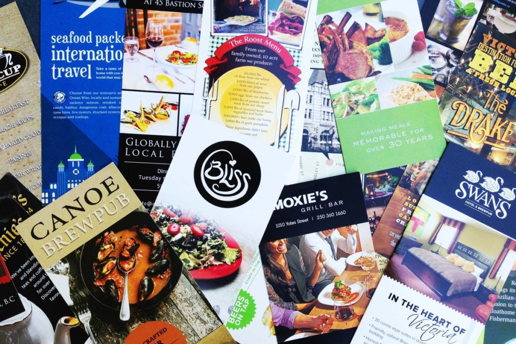
A whopping 1.9 billion tourism dollars are spent in Victoria every year – a city of just 350,000 residents. From a communications standpoint, this means rows and rows of 4” by 9” Rack Cards at visitor kiosks throughout the city.
A friend recently visited the main Tourism Victoria kiosk at the waterfront and grabbed a copy of every single rack card in the building. He then handed the whole stack over to me. After combing through the inventory, here’s my take on best practices in rack card design:
1. Mind the top two inches. Rack cards present an interesting design challenge because the front top two inches matter most – it’s usually the only the part that sticks above the other cards in the rack.* Around 90% of the cards use a horizontally-aligned logo in that space. But a logo may not be the best call (see below) – especially if you have an abstract brandmark that wouldn’t be intuitive to newcomers.
* The Tourism Victoria kiosk is a welcome exception with 100% views of their rack cards.
2. Photography matters. Pictures tell a story more quickly than words. It’s amazing that retailers can spend thousands of dollars having rack cards printed, but will skimp the extra few hundred dollars to have a good picture or two of their venue. The same often happens with websites!
3. Less is more. Visitor’s kiosks are visually crowded. Every card is vying for attention. This means that the messaging needs to be crisp and to the point. You don’t need to put your whole menu on the Rack Card in 4 point font.
4. Remember your audience. Well over half of the rack cards I surveyed had a map on the back – but less than 5% had a map from the main Tourism Victoria kiosk to the actual destination. For visitors who are new to town, this is extremely helpful detail. Out-of-country travellers may not have local access to data on their smart phones, and can’t just look up your address. Giving estimated walking times from the kiosk to the destination is another nice touch.
SOME EXAMPLES
Zambri’s is a top-rated Italian restaurant in downtown Victoria, and had one of the best rack cards in the city. Interestingly, the designer skipped the logo in favor of a three-word message in the top two inches: “Zambri’s is Italian.” The full-size photo on the front is compelling. It communicates that Zambri’s doesn’t just have good food, they have culinary expertise. The back has a map from the kiosk to their location. It also has a generous coupon for a free gelato just for showing up.

The above breakfast restaurant (I’ve blurred the logo for anonymity) is a classic case of what not to do. The picture quality is poor; the rack card is crowded front and back; the font sizes are puny; the map on the reverse is barely legible. The menu is printed with prices (in unusual amounts) which seem to have been later changed, requiring an awkward sticker placement to cover them up. But most puzzling of all is the wrong-direction picture placements on the bottom right, even when there was room for them to be stacked correctly.
Oh so clever
Finally, here is a this hilarious example of a fictitious rack card that was furtively placed in visitor’s kiosks in LA. If only it were real… Thanks to Kyle Wheeler for this reference.