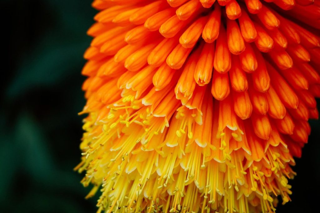
 If you have eyes to see them, gradients are everywhere in the wild: the subtle transition between colours on a flower petal, the flowing bands of a fall sunset; the varied hues of leaves coming into maturity. Gradients are also popping upon the desks of graphic designers around the world, working their way into all manner of logos, product packaging and more.
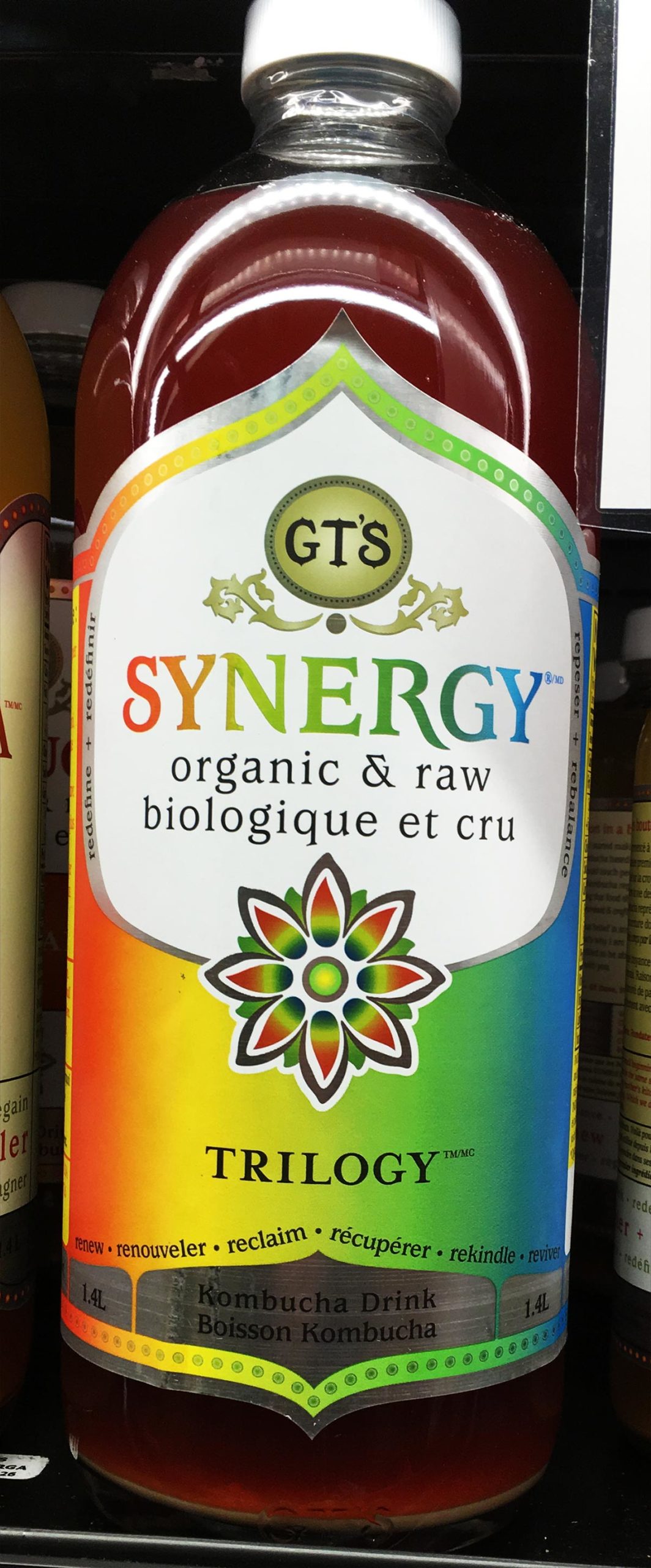
All of this came home yesterday in the supermarket, when I was visually arrested by the effusive, gradient packaging on a bottle of Kombucha. I count at least four distinct colour stops on the background and several more on the word SYNERGY.
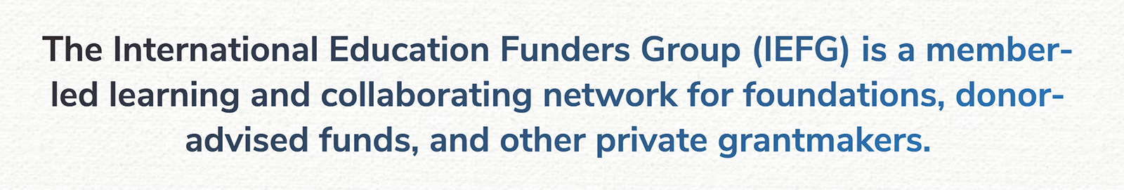
A couple forthcoming sites from Vibrant Content feature our first significant foray into gradients. Honestly, I’m finding gradients a bit addictive; they add a welcome degree of movement to what may previously have only been static text. On one site, I’ve played around with making headline text take a slight gradient between a darker and lighter blue (see below). For longer mission statements such as this one, the gradient seems to add extra visual interest:
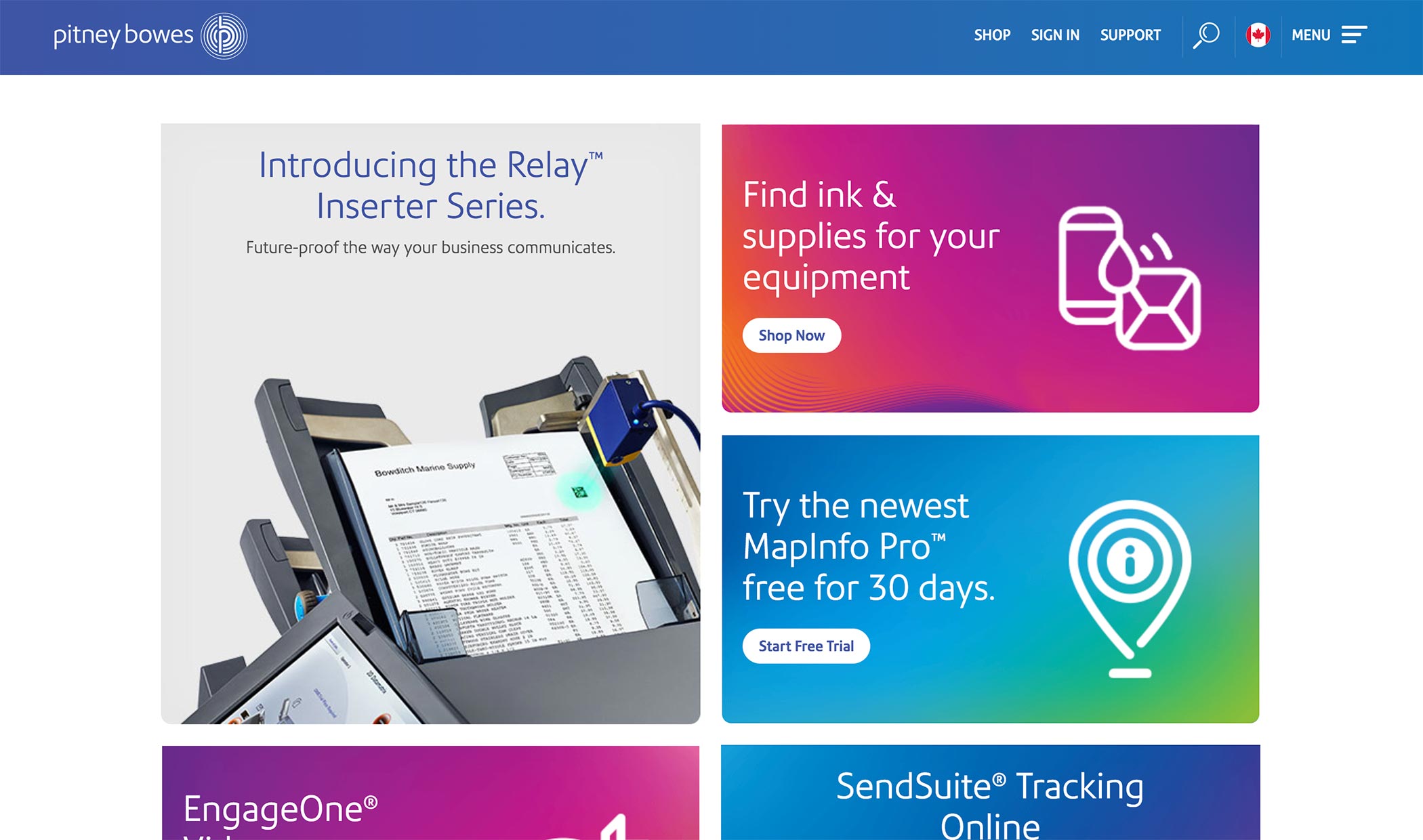
Other web designers are using bolder, brighter gradients to rebrand organizations. Instagram’s 2016 logo revision is perhaps the most egregious example of this. Pitney Bowes has a subtler gradient on its 2015 logo revision, and also uses a variety of dynamic gradients on the home page:
The trend towards using gradients shows no signs of slowing up soon. With the advent of improved styling capabilities for web browsers, we’re especially likely to see gradients appear even more online. I welcome this trend as an echo of what we already see in the world around us.