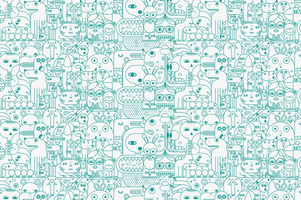
Last month, I stopped by 49th Parallel, a fantastic local coffee shop in Vancouver and was roused from my morning stupor by the design of the coffee cup as much as its contents. The designer used a device called a monoline – a hand-drawn effect with single, thin lines of the same thickness and colour.
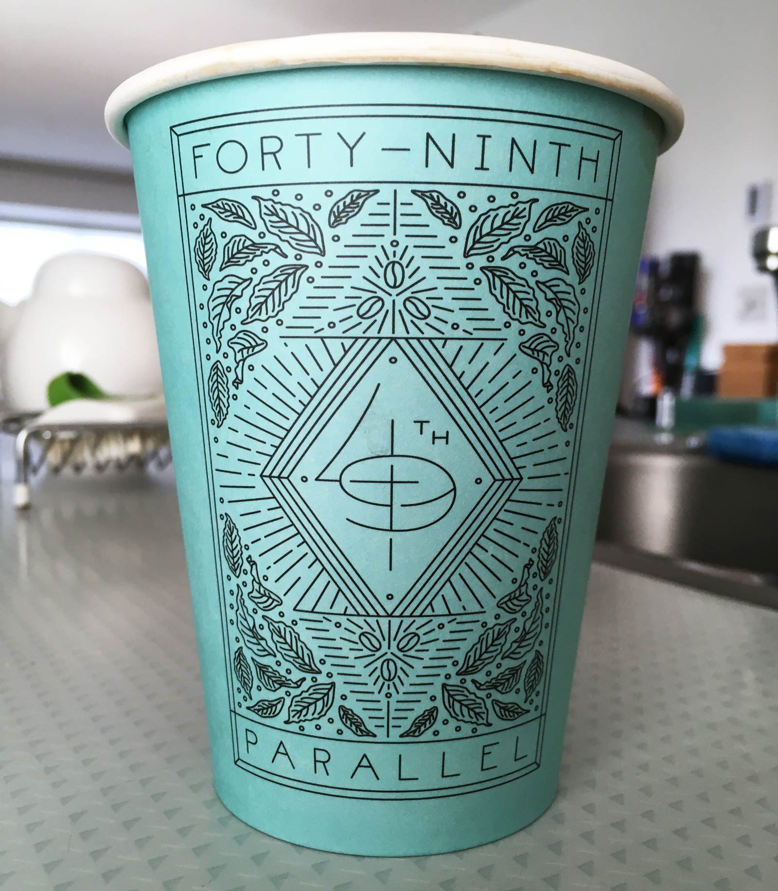
Whether or not monolines a rising trend in graphic design is debatable. They are praised for achieving a bold and consistent tone without sacrificing simplicity. I find their appeal goes beyond simplicity: monolines add a distinctly human element to graphic design. They are doodle-y. In contrast to the cold geometry of a Swiss serif font, they are informal and imperfect.
The hand-drawn aesthetic of monoline design is a good match for local retail stores and one-off coffee shops. But it seems corporations are also keen adopt monolines to appear more local and folksy. Starbucks, for example, also recently released a monoline design for cups in the USA.
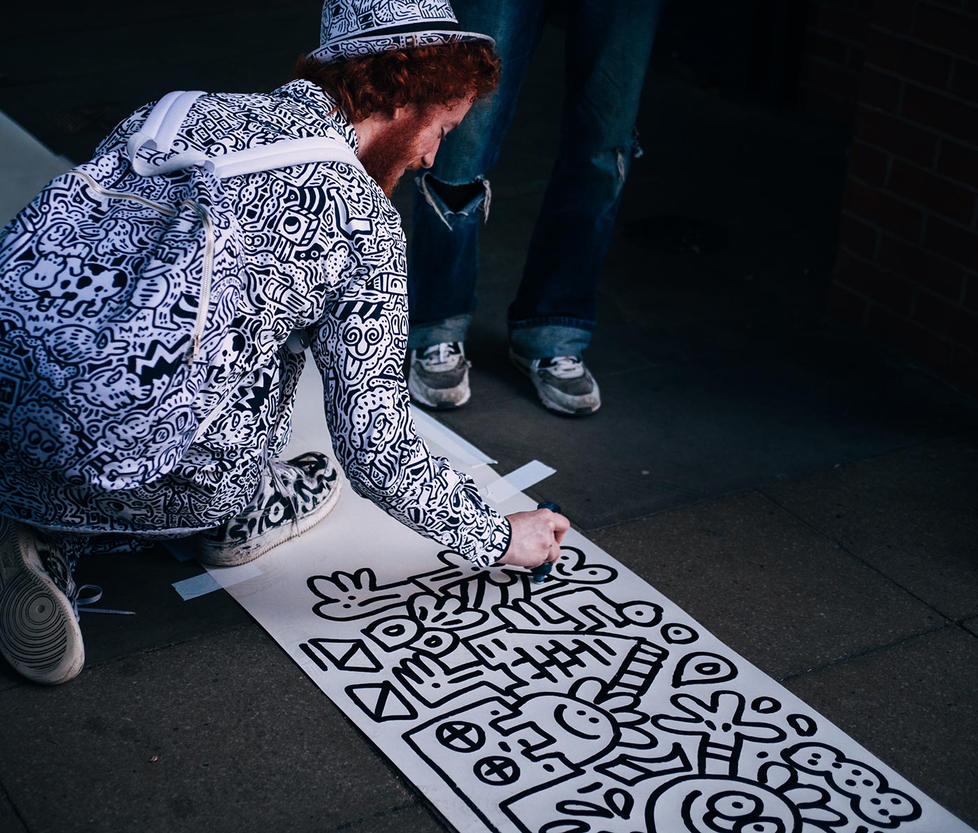
The art by Shogo Ota is brilliant, but I am cynical about the corporate marketing strategy. Is the world’s largest coffee chain merely posing as a friendly, local cafe?
If I were to brand for a local coffee shop from scratch, I’d explore the use of actual hand lettering – not a script font, not digitized handwriting, but actual pen-in-hand lettering. Hire a calligrapher to write a ‘Mocha’ with wild flourishes and swashes on the coffee lid. Hire an art student to doodle the word ‘Muffin’ on the brown paper bag. It’s a totally impractical, time-consuming concept. But it would stand out in a world where everything seems mass-produced and even monolines can deceive.
 Monoline from article top: Jonathan Calugi