I recently had a meeting with a group of international academics and presented website design options for their review. The first was crammed with off-centre overlapping gradients and seemed to fit their creative brief for a fluid design. The second experimented with a design motif I recently discovered – the plexus.
A researcher from England immediately commented: “The gradients are so 2008. The plexus is so today.” His words swayed the room and we landed on the plexus design:

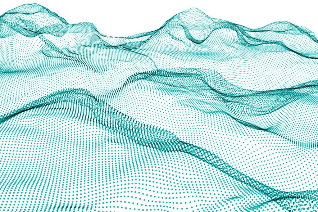
In medical terminology, the word plexus means “a network of nerves or blood vessels.” A similar networking and branching can be seen in plexus design. In contrast to the minimalist geometry of much contemporary graphic design, plexus reveals complexity and depth. It’s a good fit for the technology or research organizations as it instantly evokes ‘big data’, 3D maps or scientific charts. When done right, plexus adds add plasticity and movement to otherwise static two-dimensional elements.
I won’t vouch for plexus as a full-blown design trend, but elements of plexus design seem to be popping up more frequently. Most examples of plexus seem to use dots connected with lines (see below) – which trigger, at least in my memory, bewildering moments from high school biology. I find greater promise in the more fluid ‘particle wave’ designs as they result in a cleaner, less-angular look. In any case, plexus is a welcome response to the bare geometric elements currently sweeping contemporary graphic design.